Colour everywhere
products. Appetizing, right? Each package stands out on the counters and aisles with a brightness that gives our products and food a warm, inviting look and adds some colour to your grocery basket—and your household!
Clear information
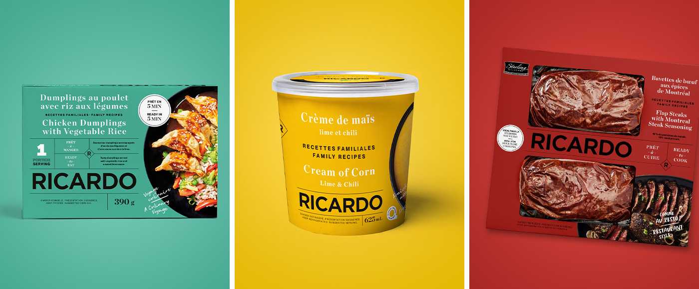
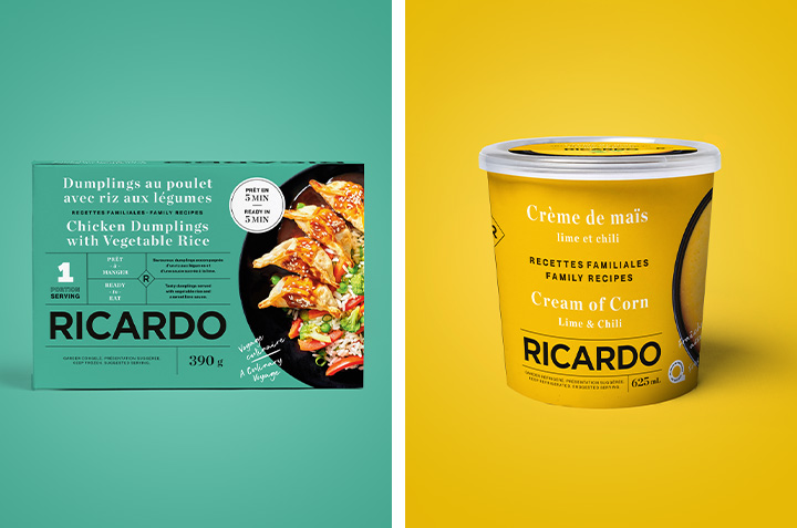
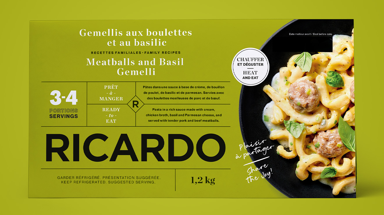
Whether it’s our soups, our seasoned fresh meats or ready-to-eat dishes in family or individual format, you can read at a glance everything you need to know: a description of the dish, the number of servings, the amount offered in the container and some cooking indications. This information allows you to make an informed choice in seconds. And with the word RICARDO written in full on every package, you know you’ve found us!
The little RICARDO wink
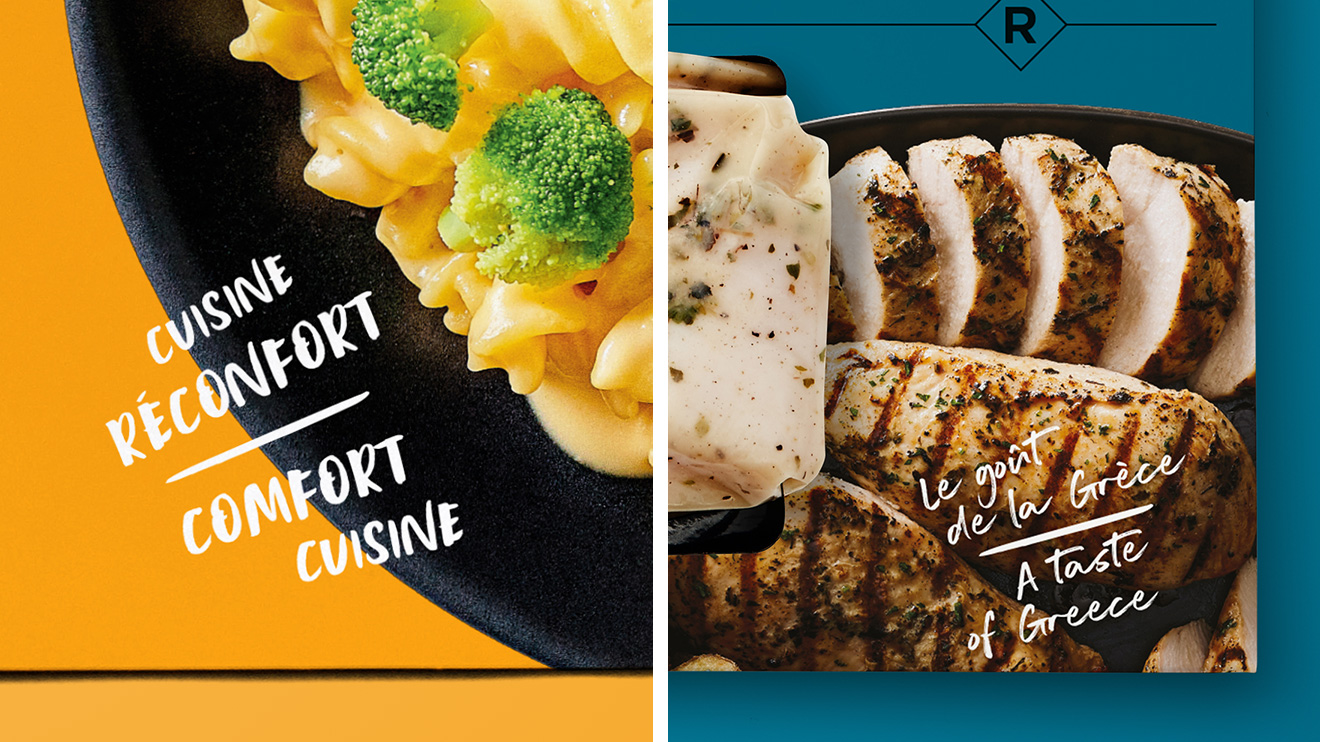
These packages have been created to make your life easier when you make your purchases. We think of you when developing them with our partners, and we want to speak to you, even at the grocery store. Sometimes there will be a quote from Ricardo, or a nice note about something that we want to communicate. Fancy a culinary journey, a dinner that won’t leave you with a pile of dishes, or some comfort cooking? You will know this immediately by looking at the product.